Sunday, 12 January 2014

Evaluation


Final Magazine

After taking the improvement comments into consideration this is my final outcome:


Improvements

To make my product the best that it can be i asked my friends and other students to look at the final picture on my process page and tell me how i could improve my magazine, this is the comments that i got back: 

Front Cover Improvements:
  • Elliot – “Some of the text doesn't link with the genre that your magazine is and you do not have a bar-code, price and other stuff that makes it look like a magazine. The Masthead works well with the genre and all the writing matches the house style that you are going for to create the branding.”  
  • Tom – “The layout of the text works well as it is either side of the image and there is a lot of writing down the left side of the page making the magazine look real. To make the image better you could make sure that the model looks the same on every page so that she has the same makeup on and stuff like that so it shows a clear link throughout and creates a brand to the magazine.” 
  • Megan – “you have not added a bar-code or price to the magazine so it doesn't make it look very realistic. The image quality is great and the layout of the magazine is really good. You have also talked about the USP that you have in the magazine, this is good because it make the magazine look professional. To Improve the Front cover even more you could make the image match the others of that model by adding red lips and making sure that the lighting is perfect.”  

Contents Page Improvements:
  • Alice – “The layout of the contents page is neat and tidy and works well with your genre. The images that you have used are all very similar and they are all posed the same, this makes the magazine look less professional. I feel that this magazine looks more like a classical magazine than a jazz magazine as the images that you have used look smart.” 
  • Evelyn – “You have use the colour scheme very well on the contents page as you have edited the back ground to match the blue colour scheme which shows a clear branding of the image. The images are too similar though.” 
  • Emma – “The headings for the type of stories that would be shown in your magazine stand out a lot as they are boxed round and the colours match the colour scheme. Although the images are of good quality they are all posed the same and the stories aren't related to your genre.” 

Double Page Spread Improvements:
  • Harry – “The layout looks very smart and professional which is good as it matches the genre your are going for. But the text was too spacious around the guitar which made it look less professional. There is also gaps of writing where there should probably be writing there. You should sort out the text layout so that there are no gaps. With the images that you have used I don’t think a guitar is a very jazzy instrument, to improve this you could make it into a classical magazine as it looks more classical than jazz.”  
  • Caitlin – “The pictures are of great quality and have been edited appropriately but the instrument in the photo doesn't really go with the genre that you are looking at as it can be seen as being a more classical magazine. You do not have any quote boxes that stand out to catch the readers eye and the writing is very straight and boxed maybe it would be better and you would be able to see that you have gone round the outline of the image of the model leaning on the guitar so the text raps around it.” 
  • Katie – “The colour scheme runs throughout the magazine which is good because it shows branding. You also made sure that the masthead stood out and you overlapped the model so it makes her look more important. There are a lot of gaps on your page so maybe you could consider covering them up with either more writing or pictures.”   

Magazine Process

This is the process of my magazine:


Manipulation of my Images

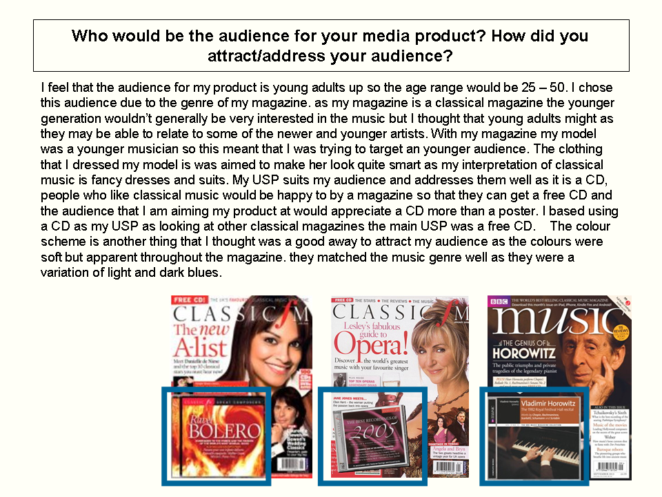
Front cover image manipulation:

I edited this image in order to match the genre better and make all of my images of the model link.  With this image I used the selection tool selected the lips of my model, I then when to adjustments > hue and saturation and I changed the colour to a red so that her lips looked more red like she had lipstick on, I also refined the edge so that the lips didn’t have a ridged edge to them.   


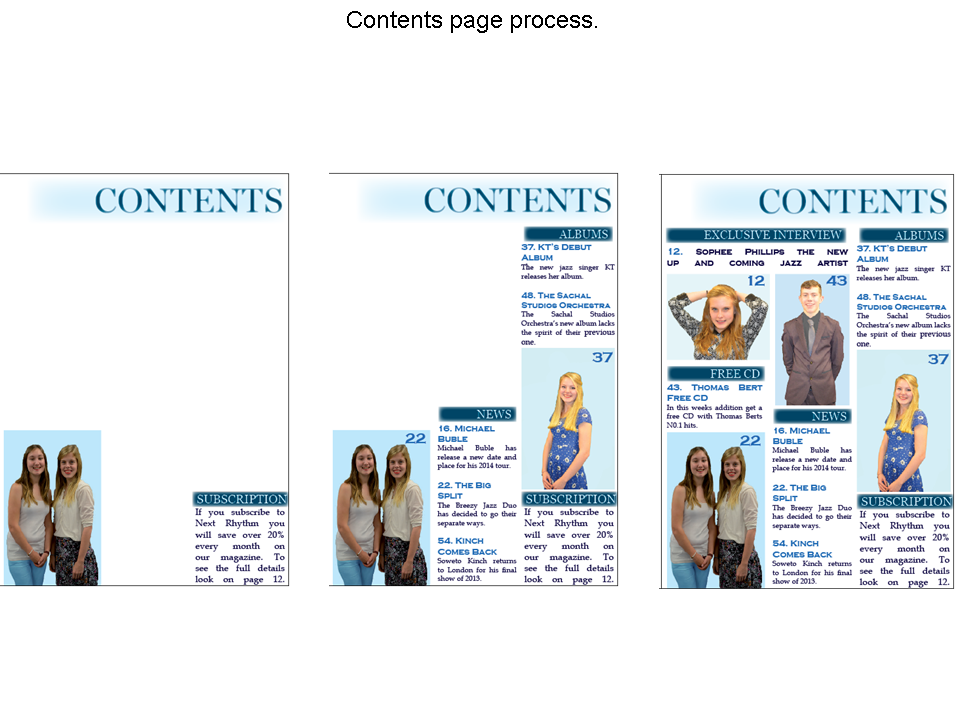
Contents page image manipulation:
For the images on my contents page I also used Photoshop to manipulate some of the images so that they worked better with my genre and branding of the magazine.

With the first image I edited this image so that the background behind the model went with the colour scheme of my magazine. this allowed me to create branding. I also cropped this image so there wasn’t so much background space in the image.  I used the crop tool to crop the image down to shape and then I used the selection tool and selected all of the model, then I picked the colour that I wanted to be the background and I refined the edge, then with the brush tool I painted the background the colour blue to match my colour scheme.


With the other image I cropped it so that there was less background space and you couldn’t see the edge of the wall and I also changed her lip colour to red to match the front cover image to create branding. I started by using he crop tool to crop down the image slightly. I then used the selection tool and zoomed in to select her lips, I then went into adjustments >  hue and  saturation and I changed the colour to red so it looked like she had red like in the other image and I also made sure that the edge was refined so that it didn’t look bumpy and unrealistic.  


Double page spread image manipulation:
For my double page spread I also manipulated two of the images so that they worked well with the genre of the magazine and they matched the other images of that model.

With the first image I started by deleting the background. I did this by selecting the model and the guitar and then I went select > inverse  which made the selection go around the girl I then  cut away the background using the cut tool. One I did that I selected the models lips and refined the edge so that it wasn’t bumpy and I then went to adjustments > hue and saturation and changed the hue so that the lips looked more red. I then did the same thing with the guitar face so that it wasn’t as orange and was more brown. With the guitar I also used the clone tool to take away the chips in it.


With the other image I used the selection tool and I selected the model, I then went into select . Inverse so that the background was selected, using the  cut tool I then cut away the background. I then selected her lips with the selection tool refining the edge so that it they weren't bumpy and I then changed the hue to a red colour by going into adjustment . Hue and saturation so that she looked like she was wearing lipstick. 

Mock Ups For Magazine

These are the mocks for my front cover, contents page and double page spread:

Contents Page:

 Double Page Spread:

Front Cover: