Sunday, 12 January 2014

Evaluation


Final Magazine

After taking the improvement comments into consideration this is my final outcome:


Improvements

To make my product the best that it can be i asked my friends and other students to look at the final picture on my process page and tell me how i could improve my magazine, this is the comments that i got back: 

Front Cover Improvements:
•
  • Elliot – “Some of the text doesn't link with the genre that your magazine is and you do not have a bar-code, price and other stuff that makes it look like a magazine. The Masthead works well with the genre and all the writing matches the house style that you are going for to create the branding.”  
  • Tom – “The layout of the text works well as it is either side of the image and there is a lot of writing down the left side of the page making the magazine look real. To make the image better you could make sure that the model looks the same on every page so that she has the same makeup on and stuff like that so it shows a clear link throughout and creates a brand to the magazine.” 
  • Megan – “you have not added a bar-code or price to the magazine so it doesn't make it look very realistic. The image quality is great and the layout of the magazine is really good. You have also talked about the USP that you have in the magazine, this is good because it make the magazine look professional. To Improve the Front cover even more you could make the image match the others of that model by adding red lips and making sure that the lighting is perfect.”  

Contents Page Improvements:
  • Alice – “The layout of the contents page is neat and tidy and works well with your genre. The images that you have used are all very similar and they are all posed the same, this makes the magazine look less professional. I feel that this magazine looks more like a classical magazine than a jazz magazine as the images that you have used look smart.” 
•
  • Evelyn – “You have use the colour scheme very well on the contents page as you have edited the back ground to match the blue colour scheme which shows a clear branding of the image. The images are too similar though.” 
•
  • Emma – “The headings for the type of stories that would be shown in your magazine stand out a lot as they are boxed round and the colours match the colour scheme. Although the images are of good quality they are all posed the same and the stories aren't related to your genre.” 

Double Page Spread Improvements:
•
  • Harry – “The layout looks very smart and professional which is good as it matches the genre your are going for. But the text was too spacious around the guitar which made it look less professional. There is also gaps of writing where there should probably be writing there. You should sort out the text layout so that there are no gaps. With the images that you have used I don’t think a guitar is a very jazzy instrument, to improve this you could make it into a classical magazine as it looks more classical than jazz.”  
•
  • Caitlin – “The pictures are of great quality and have been edited appropriately but the instrument in the photo doesn't really go with the genre that you are looking at as it can be seen as being a more classical magazine. You do not have any quote boxes that stand out to catch the readers eye and the writing is very straight and boxed maybe it would be better and you would be able to see that you have gone round the outline of the image of the model leaning on the guitar so the text raps around it.” 
•
  • Katie – “The colour scheme runs throughout the magazine which is good because it shows branding. You also made sure that the masthead stood out and you overlapped the model so it makes her look more important. There are a lot of gaps on your page so maybe you could consider covering them up with either more writing or pictures.”   

Magazine Process

This is the process of my magazine:


Manipulation of my Images

Front cover image manipulation:

I edited this image in order to match the genre better and make all of my images of the model link.  With this image I used the selection tool selected the lips of my model, I then when to adjustments > hue and saturation and I changed the colour to a red so that her lips looked more red like she had lipstick on, I also refined the edge so that the lips didn’t have a ridged edge to them.   


Contents page image manipulation:
For the images on my contents page I also used Photoshop to manipulate some of the images so that they worked better with my genre and branding of the magazine.

With the first image I edited this image so that the background behind the model went with the colour scheme of my magazine. this allowed me to create branding. I also cropped this image so there wasn’t so much background space in the image.  I used the crop tool to crop the image down to shape and then I used the selection tool and selected all of the model, then I picked the colour that I wanted to be the background and I refined the edge, then with the brush tool I painted the background the colour blue to match my colour scheme.


With the other image I cropped it so that there was less background space and you couldn’t see the edge of the wall and I also changed her lip colour to red to match the front cover image to create branding. I started by using he crop tool to crop down the image slightly. I then used the selection tool and zoomed in to select her lips, I then went into adjustments >  hue and  saturation and I changed the colour to red so it looked like she had red like in the other image and I also made sure that the edge was refined so that it didn’t look bumpy and unrealistic.  


Double page spread image manipulation:
For my double page spread I also manipulated two of the images so that they worked well with the genre of the magazine and they matched the other images of that model.

With the first image I started by deleting the background. I did this by selecting the model and the guitar and then I went select > inverse  which made the selection go around the girl I then  cut away the background using the cut tool. One I did that I selected the models lips and refined the edge so that it wasn’t bumpy and I then went to adjustments > hue and saturation and changed the hue so that the lips looked more red. I then did the same thing with the guitar face so that it wasn’t as orange and was more brown. With the guitar I also used the clone tool to take away the chips in it.


With the other image I used the selection tool and I selected the model, I then went into select . Inverse so that the background was selected, using the  cut tool I then cut away the background. I then selected her lips with the selection tool refining the edge so that it they weren't bumpy and I then changed the hue to a red colour by going into adjustment . Hue and saturation so that she looked like she was wearing lipstick. 

Mock Ups For Magazine

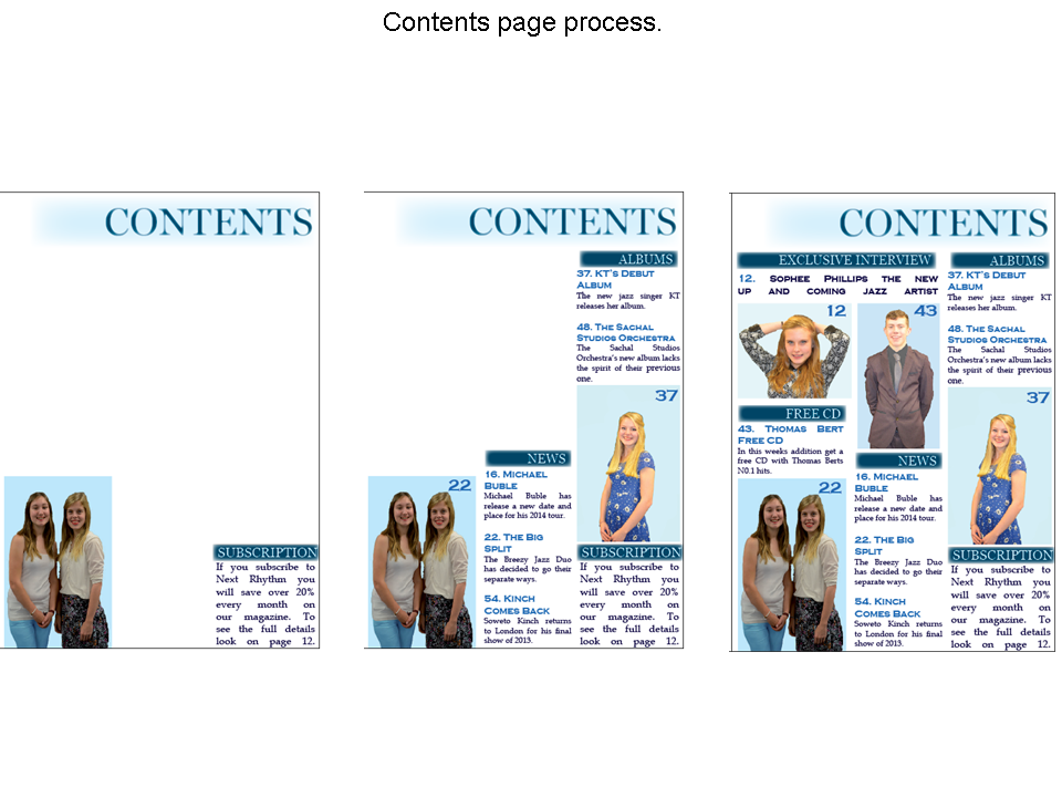
These are the mocks for my front cover, contents page and double page spread:

Contents Page:

 Double Page Spread:

Front Cover:


Monday, 25 November 2013

Select and Deselect

I have taken some images to go onto my blog and i may also need to take some more as i feel that the images i have taken are all very similar and i must experiment more with my models and props. With the images that i have got i have made a select and deselect image, this is where it shows which images i will be using, could possibly use and which images i'm not going to use in my magazine.  

Moodboard

As part of my magazine research I put together a moodboard to help generate ideas that I would want to put on my magazine. I put lots of different pictures and key words to trigger thoughts of what my magazine could look like. My moodboard is in sections so that it is easy to see that I have made connections through most of my images that I have found. This is my moodboard that I created in order to get idea on how my jazz magazine could be created in order to look professional and appeal to my niche target audience: 
 Although my magazine is to do with jazz music, the way that the models look is important as you need to make sure that the magazine looks professional so you would want the artist/bands look like they are jazz players. The important thing is that I DON’T make my magazine look like a fashion magazine so I need to make sure everything is jazz related.
I have put pictures of suits/hair/make-up on my magazine as those images are the style that I want to inspire my models to look like so that my magazine will look professional like it’s a jazz music magazine. I think that the boy models that I put on my magazine should be wearing suits so that they look old fashioned, smart and jazzy. I wanted to go for an old fashioned look with both the men and women to give that jazz vibe off the magazine. From the images that I have gathered I would like my models to have big make up and big hair/curly hair this will make the models look old fashioned.
Another thing that I have in put into my moodboard is the instruments that I relate to jazz music. This is so that I can get an idea as to what instruments I might want to use in my magazine. I feel that the main instruments that you could see or hear in jazz music are piano, trumpet, saxophone, double base, trombone and others. Other thing that I would like to try and include in my magazine is an old microphone so that it looks like an older fashioned and jazz like magazine. Another thing that I incorporate with jazz is vinyl’s this is because they are old and vintage.
Something that I need to think about when doing my magazine is whether I am going to use a band or artist or both. I have put those images on my moodboard as well so that it shows the contrast of things that I may include in my magazine. Another thing that I have put on my moodboard is pictures of Michael buble. This is because he partly a jazz singer as well as doing other things such as pop. He is also quite an inspirational singer and the way that he portrays himself is important as I might be able to incorporate that into parts of my magazine so that I can use him as part of my impressions to the magazine as well as making it look more realistic. 

This images are on my moodboard and are
to represent the different types of angles
that i could use in my magazine.
Another angle which i find
would look good on
my magazine.
The angles of the images are important as I want to make my magazine look professional. On my moodboard I have added different images that show different angles to the artist that is being shown in the image, this is so that I can get a bigger idea of how I might want the images on my magazine to look and how I should take my images so that I can make my image look professional. 

 I put words around edge of my moodboard to give myself more inspiration on what I can incorporate inside my magazine. To make the magazine look realistic I need to look at what a jazz magazine might entail inside. I also need to have an idea of what my magazine masthead is going to like. This is why I added a magazine masthead to the image to create ideas of what my jazz magazine masthead is going to be like.
This is the magazine masthead that is on my
 moodboard to try and give me inspiration.

questionnaire analysis


For part of my audience research in the process of making my jazz music magazine I made 3 different  questionnaires so that I could find out information on what my target market likes. I asked 3 lots of 10 questions so  could find out a lot of information on what my target audience is.

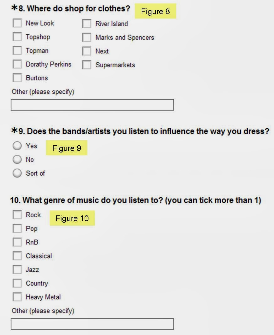
For my first questionnaire I asked a ranger of questions that would help me to find my audience and get to know more about them. The first 3 question that I asked (Figure 1,2 & 3) was asked so that I could find out my main target audiences and how far people would be willing to go to get a magazine. I also wanted to know where people mainly shop for a magazine so that I would know where to put more of my magazines. This is why I asked question four (figure 4). I then went on to talk about social networking sights as I feel it is important that when making a magazine you know which social networking sights they go on so you can find out advertising. The first question asked was if my audience used social network sights (Figure 5) the reason that I asked this is so that I know what my target audience likes, I then went on to ask how many times a day do they use a social networking sight (Figure 6) I feel that this is important as you need to know roughly how often the ad needs to be show. The last question that I asked about social networking sights was which one did they use the most (Figure 7). With this question they could only tick one as I wanted to know which social network sight my audience used the most so I could use it for advertising. The next question I went on to ask was to do with were they shop (figure 8) the reason that I wrote this question was because the next question (Figure 9) was a follow up question that asked if the way they dress from those shops is influenced by the music they listen to. It is important that I find this out because I need to know if the clothes that my models wear are important or if they can wear anything because it wont matter to the reader. My last question (Figure 10) asked what type of music they listened to as you can listen to more than one genre and I needed to know whether I needed to try an widen my audience

For the second questionnaire I wanted to find out more about my audience. The first question that I asked is show in Figure 1. the reason I asked this question is so that I could find out what TV my audience likes the most so then I would know where I need to advertise my magazine. I then when on to ask another question (Figure 2) this question was important as it asked how often my audience watched TV. I need to know this so that if I was to advertise my magazine I would know how many times I would need to put my magazine advert a day. I also needed to now what channels they watched (Figure 3 – question 3) so that I would know what channels to put the advertisement on. The 4th question was to do with colours (Figure 4) it is important that  find out what colour people associate with jazz magazines as that’s the genre I am making my magazine as and I would need to know what colour people would think would suit this. I also needed to know whether the colour scheme would influence someone to buy a magazine so I knew whether it was really important or not. This is why I wrote (Figure 5) so that I could find out whether people notice the colour scheme a lot. (Figure 6 & 7) was to do with hairstyles. The first question asked what their hairstyle is and their second question asked was this influenced by the music you listen to. I felt like these questions were important as I wanted to know whether I needed to make my models hairstyles to suit the music genre or not. The last 3 questions (Figure 8,9 & 10) were to do with there hobbies, its important that you find out everything about your audience so you know how important music is to them. The reason for asking about their hobbies and whether it related to their preferred music genre is so that I knew how important music was to my audience.

The last questionnaire I wrote was more to do with magazines and what my audience would like to see in this magazine. The first question that I asked was about price (figure 1) the reason I asked about price is because you want to know how much your audience is willing to pay for a magazine as I don’t want to over price my magazine. The next 2 questions (Figure 2 & 3) was about the USP (unique selling point) on a magazine. The first question was asking if they would want a USP on the magazine and the next question asked was what USP would they like to see. I want to know what people like to see on a USP so I get an idea of what I could use on mine. (Figure 4) was talking about online magazines as I want to know whether an online magazine is beneficial to my audience. The 5th question that I asked was if you would subscribe to a magazine. I want to know this so that I can find out if subscribing is beneficial to my customers. Question 6 (Figure 6) is a question that still related to subscription as I wanted to know whether people would subscribe online or on paper more so that way I would know which is the best method for my magazine. Question 7 (Figure 7) was to do with the front cover and whether a band or artist on the front would make you want to buy a magazine more. I asked this question so that I could find out whether having a band or artist on the front was better so that I could think about my layout of the magazine and what could possibly go in the magazine. The last 3 questions (Figure 8,9 &10) were more personal and were about my audience as I wanted to know a little bit more about them. I asked whether they play/played an instrument or not and whether that instrument was an influence to their music. I feel it important that I know what influences people to listen to the music they listen to as it will help make my magazine.  


Monday, 14 October 2013

Focus Group 2

Today in my lesson we did another focus group which was recorded. We got given particular types of question topic and they had to come up with 3 questions to ask to the year 13’s in the class next door. My topic of question was any other question that I could come up with, so these are my questions and the answers that were given by the year 13’s:

What colours would you find affective when looking at a magazine?
One of the year 13’s said that it depends on the genre if you was going for a heavy metal magazine you would want to see dark colours like black but if you was looking at a pop magazine you would want to see more bright colours like pink and purple.  

How much would you be willing to pay for a magazine?
One of the students in the class said that the most they are willing to pay for a magazine would be £2.99 and another student mentioned that they would only pay £1.99 because of the recession.

Would a having unique selling point on the magazine make you more interested in buying it? (CD, posters etc)
The whole class agreed that a unique selling point would make them more interested in buying the magazine as you would generally be getting a free item. One boy then went on to say that stickers or posters would be cool as you would be able to stick them where ever you want and it would make the magazine more interesting. One student said that a CD would be more interesting and would attract the audience well as that way you would have something to listen to like and that maybe a track of there latest song would be interesting.
 
This is the video that was recoreded whilest everyone ask there questions to the class:

Sunday, 13 October 2013

Audiences

Today in my media class we learnt about audiences. Audience is an individual or collective group of people who read or consume any media text for example radio listeners.
Why is the audience important?
  1. Without a audience there would be no media
  2. Media organisations produce media text to make profit and without the audience there would be no profit made.
The mass media is becoming more competitive than ever to attract more audience in different ways to stay profitable.

Impact of new technologies on audiences
Old media such as TV, print and radio used to have a high audience numbers now they have to work hard to maintain the high audience numbers. Digital technology has also lead to an increasing uncertainty over how we define an audience, with general agreement that a large group of people reading the same thing is seen as the audience as being “fragmented”.  
Fragmented: The division of audiences into smaller groups due to the variety of media E.g. news > online and hardcopy
Aim to it many people
With magazines they aim to print less so by putting there magazines online not only does it give a wider audience it also reduce the amount of printing.

Type of audience
Mass audience: Media and communication that targets a very large group of people (women, men, children etc)
E.g. friends, heat magazine, top gear, Disney films
Niche audience:  Much smaller audience but very influential and has a unique interest that would only appeal to a small audience.
E.g. Birds magazine, aimed at people who like bird watching.

Categories
Categories are divided by social class.
Psychographics
Every advertiser wants a particular type of audience. In terms of commercial media, much of fundraising is generated by advertising.

In society there are different types of class, the class ranks would generally generate what type of media they would watch or buy.   
Group A
  • Lawyer
  • Doctor
  • Scientist
  • Well Paid Professionals
Group B
  • Teachers
  • Middle Management
  • Fairly Well Paid Professionals
Group C1
  • Junior management
  • Bank Clark
  • Nurses
  • White Collar Professional
Group C2
  • Electricians
  • Plumbers
  • Carpenters
  • Blue Collar
Group D
  • Manual
  • Drivers
  • Post Sorters
Group E
  • Students
  • Unemployment
  • Pensioners
Research Methods
How do you measure audiences?
  • Sales
  • Subscriptions
  • Ratings
  • Figures
Who measures audiences?
  • NRS
  • ABC
  • BARB
  • Booksellers
New Media
Facebook and social networks
Online forums
Views on YouTube
Twitter trends

Quantitative research is to do with questionnaires, numbers, closed questions and factual. These type of questionnaires not that wide range and very factual but t the same time they are not specific enough. Qualitative research is doing focus groups or interviews, analysis of existing products, open questions this is for open interpretations and individual preferences.


Sunday, 6 October 2013

Format Research Magazine 3 - Q

The third magazine that i looked at was Q magazine. i started by looking at the front cover and analyzing it:
 On the front cover of Q magazine there is only one image and that is the main image, this is of the band Arctic Monkeys. This image covers the whole page and is big and bold. It then has writing to the left side of the image this clearly shows that it is the main article of the issue this week and that it is an important part to the magazine. Part of one of the band members head covers part of the masthead, although you can still clearly see the masthead this shows that the band is an significant part of the magazine and they are trying to make it more eye catching so that the viewer will read the article inside.

The Bar-Code of this magazine is in the right hand bottom corner, this is good because it means that it is out the way and it will not interrupt anything else on the magazine front cover. The bar-code also has the price right next to it in really small writing, this is also good as it means that it is out of the way. This could also be seen as a bad quality of the magazine though as you need to be able to see the price quite clearly and the writing is too small and it blends in with the bar-code to much so you struggle to find it when taking a first glance. People want to be able to see the price so they know how much they will be paying for the magazine.

I then went on to analyzing the contents page of Q:

After that i then finished by analyzing one of the double page spreads from the magazine: 

This article from Q magazine is about Rizzle Kicks and how they challenged Andrew Perry to a go karting competition, it also talks about there music that they have being doing and a bit about them. This article is very different compared to the rest of the magazine as from the front cover you get the idea that the magazines genre is punk rock and music like that but actually this magazine clearly has a wider range and audience as they have pop rap Rizzle Kicks article inside.

The layout of this double page spread is one big picture. It has a main image that covers the whole double page spread. This picture is of the two boys in there go carting outfits the image is so big so that it catches the viewer’s eye and would make them want to read on. The article also has a small amount of text which is written in a small serif font the reason that the font is small is so that they can fit more writing on the page and then even more writing on the second double page spread that they have wrote more on. The masthead of this article is very different as it is scattered on both of the pages on the left side it says “Top “ and on the right side it says “Gear” this is quite quirky. The writing is in a san-serif font and is really large this is quite informal and it stands out a lot more. The subheading of the article is in a white text box and has black writing this is so it stands out more as it is in a text box. The subheading is there to give more information about the article to the reader and it also makes them want to read on more. The colour scheme is still held well with this article. They have use red white and black, black is for the background colour and some of the writing. The white is used for the masthead as it is the house style and it is also used for most of the text then you have bits of red which is used as text boxes so that they stand out more. It is good that they are carrying on with the colour scheme as this matches the brand of the Q magazine really well.   

In all I feel that this article is an informal article as it is aimed at the younger reader. It uses simple lexis so that it is an easy read for the reader. It also uses large images and small amounts of writing on the first page. Although the font is quite formal, because the masthead is so large I feel that it is more informal as it that is the main font that you see first giving you the instant idea that it is an informal article.


Format Research Magazine 2 - Kerrang

The second magazine that i analysed was Kerrang magazine. i started by analyzing the front cover: 


On the Kerrang magazine they have a big main image of the band “sleeping with sirens” this main image over laps the masthead, this shows the main image of the band must be an important part of the magazine as the lead singer is covering the middle of the masthead. The masthead is important on a magazine as it tells you want the magazine is called but as the main image is covering that this suggests that it’s not as important in this occasion. The main image also covers most of the page, giving just enough room for small images and text around it, this also suggest that the main image is the main article in the magazine as it’s one of the first things that you see on the page. The main image has the colour scheme within it too, this is good as it shows that there is a link between the brand and this would carry on throughout the magazine. The genre of Kerrang magazine is rock and having the main image as a rock band on the front shows the audience what the genre of the magazine is, the band are also dressed to look like a rock band which works really well as it shows a clear link in the magazine and that the genre would carry on through out the magazine. This will appeal to a younger audience who is interested in rock as the main image makes the front cover look informal and also everything is linked with the genre and brand.

The colour scheme of the magazine is red, white, yellow and black. White is the house style in this magazine so it will be carried on throughout most of the magazine when using masthead and subheading etc this is good as it works with the brand as they will always be using there house style. then the background colour of the magazine front cover is red, this makes the white masthead stand out against everything which is good as it means that it is easy to see and will attract peoples attention more. The colours black and yellow vary between text box colour and text. This makes the magazine more colourful, quirky and interesting it also give the feel that it is aimed at a younger audience as they have used 4 contrasting colours to catch the viewer attention toward the text and not just the pictures.


The Puff on the Kerrang magazine is in the top right hand corner of the front cover this isn’t very good as it is out of the way so people don’t see it as much because it is up in the corner rather than in a random place of the magazine to catch attention. It also does not really stand out much to the reader as it isn’t in your face and it doesn’t pop out at you as it is too hidden in the corner and isn’t bold enough to catch someone’s attention this is a bad puff as it doesn’t do what a puff should do because you can see it that well it doesn’t interest you as much. The puff has got the colour scheme of black and yellow which is good as it works well in with the rest of the magazine but it also blend into the corner slightly which isn’t good because then you tend not to notice it as much.

This magazine also has a footer at the bottom of the page which gives you more information on the magazine as it lists different band names. This works with the genre as people who are interested in those bands and the genre would by the magazine as those bands that are mentioned are more than likely to be featured inside the magazine at some point. It is also uses just one word which is each band to try and catch attention, this works well as because it is just a band name the band would interest people who like that genre.

I then went on to look at the contents page of this magazine:

The contents page of Kerrang magazine still mentions about there USP which is the green day posters, it does this by showing another image of green day which could be a poster this makes the audience more interested and wants to look at the posters it also give you more information about the USP.


I then went on to look at the article of the magazine and i analyzed that :


In the corner of the Kerrang article there is a quote form one of the members of the fall out boy band. This quote gives an insight as to what is coming up in the text of the article. This is an effective way of making the reader intrigued as to what all of the article says because it only give a little bit of information but enough information for the reader to want to read on. The Quote uses the white house style so that the colour scheme can be linked with the article and so that it looks more professional.


In the middle of the text there is a text box give you information about fall out boy but it isn’t on the same topic as the secret album. This is wrote here so that the reader gets given that little bit more information about fall out boy and so that it will get them excited about the things that fall out boy has to offer for there fans.

I find that this article is an informal article. This is due to the fact that the entire font on this article is a san-serif font which is seen as an informal font as it has no smooth edges to keep everything in line. The way that the layout is presented this also shows that this is informal as everything on the double page spread is edgy and quirky and would appeal to a younger audience. The lexis on the page is also informal as there is small non-complicated words that makes the article an easy read for the target audience.