Friday, 20 September 2013

My Final Prospectus Front Cover

over the past few days at school, i have been creating my magazine front cover. I was working with Becky on doing this but i was then told by one of my teachers that we must work alone on making our front cover as then we both would have our own creation of what the magazine should look like. 
This is my magazine front cover:
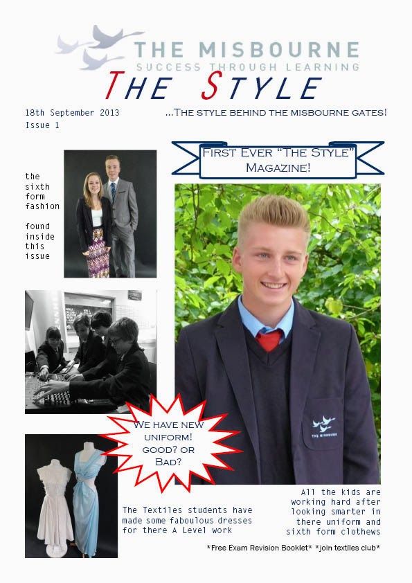
I called my magazine The Style and had the Misbourne logo above it to show that it was to do with the Misbourne school. The reason i chose a simple name was because even though its not very creative it stands out and is easy to remember. The Misbourne logo was faded so that there wasn't too much attention drawn towards it as i wanted the masthead to stand out more. Underneath the masthead i then put a little slogan so that the readers would get more of an insight as to what it was about, my slogan was "...The style behind the Misbourne gates!" i had this in a different font to the title so that it stood out rather than blended in with the title. on the cover i also added puffs so that the main information can be presented first as its would be one of the first things you would look at. One of the puffs is the banner saying "first ever the style magazine!" this would stand out letting all the readers know that this is the first ever one and it is the start up of a good magazine. The other puff is talking about the new uniform, i put that as a puff because it the talk that everyone seems to be having so it is fairly important to the readers. I then used left thirds so that if the magazine was on a stand they could only see the pictures and text that i have put on the left side of the cover. As this magazine was all about fashion and the clothes in the Misbourne school i decided to put my main image as a boy smiling wearing the new uniform (all but the tie), because the guy is smiling it gives the impression that the boy is happy in the Misbourne and that he likes his new uniform, this photo makes you think as to whether the new uniform has had a good response or not that way it makes you want to read inside the magazine. 

I also did a mock up of my prospectus contents page, by doing this it allowed me to think into what i might actually want my magazine contents page to look like.  
   

Tuesday, 17 September 2013

2nd Mock Up

This is our second mock up that was done by my partner Becky to get another idea of what our magazine front cover could look like. This mock up looks very busy but should work well. Like me the masthead was put at the top of the page rather than anywhere else so that it stands out more. then she has the main image in the middle of the page with the Misbourne logo faded behind it, i think that this is a very clever idea as it will look cool and still have then Misbourne logo on the cover. Having a quote next to this that relates to the image is very clever and it will give you a little bit of information as to what the photo is about. This mock up has also included the left thirds so that if the magazine was on a shelf you would see the left thirds first. We added the idea of faded images in the background to so that the main image it still the main focus but the viewer would still be able to look at other photos and see that they have to do with the rest of the magazine.

We decided that we are going to try and follow this mock up of the magazine but we may have a few idea changes along the line so it may not be exactly the same but this is the frame of work we are going for. 

Sunday, 15 September 2013

Key Words

My teacher asked my class to search some key words that we will need for our media work so i did and this is them:

Key Words:

Masthead: The main heading/ title of the magazine.

Left Thirds: Pictures and text that takes up the left side of the magazine

Main Image: The center, large image of the magazine

Anchorage Text: The meaning of an image in a magazine

Colour Scheme: A group of colour combinations that work well together and can be used on and throughout the magazine.

Cover Lines: A short sentence/statement that is found on the cover of the magazine giving a short insight as to the article inside.

Slogan: A short and striking memorable phrase that is used in advertising.

Hyperbolic wording: Using exaggeration in your work to make it more interesting.

Size of the price: The size that the price is on the cover of a magazine.

Layout: The way that something is arranged on a page.

Direct Address: Texts that direct the reader e.g. You

Flashes/Puffs: Random sentences that are put on the page to attract peoples attention.

Additional Images: having extra images on a page.

Location of Bar-code  where on the page the bar-code is placed.


USP (what is the magazines USP?): unique selling point a text or product that is seen as being new or unique in the market and is set apart from its competitors. 

Thought Web and 1st Muck Up of Front Cover

Over the past two days in my media class i have been working on many things with my partner, we are still yet to decide what the name of our school magazine but we have made to mock ups of our front cover, Becky did one and i did the other. We are yet to decide what mock up of the magazine we are going to use but i think we will combined both of our mock ups to create a really good magazine front cover so that way both of our ideas are collaborated into it. As well as discussing what our magazine was going to look like we also went to go see Miss Young to see if she was available to take a photo, unfortunately she was in a meeting so we haven't got a photo of her and her amazing clothes so i don't think we will be using her on our magazine as we haven't had a chance to take a photograph.

The main thing that i have done as well as the mock up of the magazine front cover, is i have created a thought web of all the things that both me and Becky have discussed and also my ideas of what could be on the magazine. The aim of my thought web it to collect all the thoughts that i have on the magazine and put them onto that thought web so then they can be further discussed with Becky and we can use some of them in our magazine front cover. She will also be doing her own thought web so with both of our thought webs we will be able to join some of our ideas and rule out what were not going to put on the magazine. 

This is my thought web:


On my thought web i have included the story's, masthead/subheading, colours, images, text types. With my thought web i have added a load of ideas that could be put into our magazine, some of those ideas me and my partner have decided on together and are the final decision but the others are just ideas that i thought could work well on the magazine.

This is my mock up of the magazine front cover. i put the masthead at the top as i think it would stand out better there than it would anywhere else on the page. I also used left thirds in my mock up as when a magazine is sat on a shelf the left side is the side that a person will see first. I thought that having a photo then text on the left thirds would be a good idea as then we could write a tiny amount about how the photo and the article that would be inside. Having cover lines and puffs on the magazine front cover would be more effective as it would give you random bursts of information on the magazine and whats inside. Cover lines are ideal for longer sentences or quotes that you might want to put in your magazine as for puff there like bold, small sentences that can attract a viewers eye to the magazine as its sort and simple yet bold and stands out well. i think that these would be good to use on our magazine as they give you a tiny insight as to whats inside as well as making you more interested in the magazine cover. As well as that it also makes it look nice. I put the main image at the side of the page as i thought that it would look better and stand out more if the main image was larger but to one side of the magazine cover.

Thursday, 12 September 2013

Our Magazine Ideas Continued...

Today in my media class, me and my partner started working on getting photographs that we needed to put on our magazine cover. We started by going into the Textiles room to find the teacher to ask if we could use the creation of clothes that the textiles students have made. The teacher said it was fine so we took the clothes stands into the photograph photo room so we could take a photo of the clothes on a black background. After that we went got a guy sixth former and I had my photo taken with him so that it could go on our magazine to she the style that the Misbourne sixth form have, once we did that we went to get another photo of a teacher as we thought that having the teachers style on our magazine would be a brilliant idea to show the school the fashion that goes on in the school. We went to see Miss Young to take a photo but she was busy she we are going to take one tomorrow instead. Because we had taken the pictures of the clothes on a black background me and Becky started to re-discuss the colour the background of our magazine front cover, we was thinking of changing it to black but we then decided against it because the Misbourne logo is navy and on a black background that wouldn't really show up well. I thought that a good idea for our magazine was to have a main sixth form girl posing in the middle of the front cover as our main image, Becky agreed that it would be a good idea and that we would discuss it further and find a girl to photograph, we then went into further consideration about the layout and how we were going to put little images round the outside of the main image.

Our School Magazine Ideas

Today in my media class, my partner Becky and I started to discuss what out school magazine should look like to try and create an image in our mind. We decided that our main theme for our magazine front cover would be a fashion theme, this meant that we would only do thing's that are fashion based within the school such as uniform, sixth form clothing etc. As we decided our themes we thought it would be good to take pictures of the textiles department as they have designed and made some amazing creations, so we went out with our camera with others to try and find the textiles teacher, we didn't actually take any photos that today we we was just going to ask if we could do that when she wasn't busy, but she was busy so we didn't ask. 
We also wanted to get some pictures of the new uniform and some sixth former's in there smart wear, she we went to take some younger children who were dressed in the new uniform to come out of there call for a tiny bit so we could take a picture. Kindly two year 9's who was wearing the uniform let us use them so we did. Another good idea that we can up with was to take pictures of some fashionable teachers who wear nice clothes, so we went and got a picture of Mr Webb for out magazine. Becky had an idea that we could have faded edge photos in the background of the front of our magazine and the background should be white so nothing clashed and looked chaotic.

The main thing that Becky and I decide was the fonts. We thought it would be a good idea to decide the fonts now so we didn't have to do it later on. It took us some time and we looked at, at least 6 different fonts but we finally decided that we was going to have theses fonts on our magazine: 

Orator STD – Masthead
Copperplate Gothic light – Subheadings
Letter Gothic STD – Writing 

we came to the decision that Orator STD would be the masthead as it was a serif font so the edges aren't straight so it doesn't look as formal. Also a decision what that Copperplate Gothic Light would be our subheadings as alike Orator STD this font is also serif so it looks less formal and it is also capitalized so it would stand out, I thought that this might not work as it could stand out more than the masthead but at a smaller font it doesn't stand out as much as the masthead. The last font that we decided to use was Letter Gothic STD and this was going to be our writing. As well as the other fonts this is also a serif font and it look interesting against the other two fonts. 


Tuesday, 10 September 2013

The Misbourne and Amersham School Prospectus


Today in class we look at and discussed our schools prospectus so we could get an idea of what targets certain parts of the media aim at when producing there magazines, newspaper etcetera.

 The Misbourne School Prospectus
On our Misbourne prospectus it was very simple with the world prospectus written in the corner, It was good how it had the world prospectus in the corner as it told the viewer what they were looking at, without that written on it the prospectus would have looked too plain and spacious as well as making the viewer clueless as to what they were looking at. Another thing that was on the prospectus was a large straight edged rectangular picture of lots of children working hard. I felt that this was very effective as it drew in the eye and showed that the Misbourne is a hard working school, all the kids have perfect uniform, with there ties done up to the top. This showed that the school is persistent and focused on getting immaculate uniform. The problem with the photo is that it’s not very colourful when it was printed the colours have merged into each other making the class look quite dull as if there school isn’t that fun. Also on the prospectus they have the Misbourne school logo which is in a san-serif font, this was also very formal as it was all straight edged and in line with the photo.

The Amersham School Prospectus Compared to the Misbourne Prospectus:

The Amersham School prospectus had some differences compared to the Misbourne prospectus. One of the differences is that there is no picture in the middle of the prospectus its just blue with a big logo on the front. I feel that this isn’t as effective as it doesn’t really show you what the school is like and it doesn’t present it well, although it does have there logo printed big in the middle. Unlike the Misbourne prospectus the Amersham School prospectus has a quote at the bottom of the prospectus, this quote is, “live, learn and succeed together” I find that this quote gives the reader the idea that it is a hard working school as they want to succeed, it is also in line with the masthead which make the prospectus look smarter. The font of this quote is serif so it’s not as formal as the Misbourne’s font but it still gives a great effect to the reader as it has meaning to the quote and make the reader intrigued as to what the school can do to get to success. Another difference with the Amersham School prospectus is that it doesn’t say the word prospectus on it, I find that this is a slight disadvantage as the viewer will not know what they are looking at so they might get confused.

The Misbourne and the Amersham School prospectus both also have similarities. The main similarity is that they both have the school name at the top of there page as there masthead, they are also in a san-serif font. This is good as it make both the prospectuses look professional as it tells you what school the prospectus is for. Having the font as a san-serif font it makes it look more formal as it would be a straight edged font.